AI Website Prompt Template: Brief, Build and Review
A useful AI website prompt is a build brief: it names the visitor, the action the page should support, the content you can supply and the checks the finished page must pass. Start with one page, review the first result in a browser, then request specific revisions.
By PromptPack · Reviewed
What do you need?
Your own AI coding tool, approved copy and images, and a browser for reviewing the result. Tool plans, hosting and assets are separate.
Copy and customize this prompt
Replace each bracketed field. Keep unknown facts marked as missing so they can be resolved before production.
Build one responsive landing page for [BUSINESS] serving [AUDIENCE].
The visitor should understand [OFFER] and take [ONE PRIMARY ACTION].
Use this approved content: [HEADLINE, BENEFITS, PRICE, CONTACT AND ASSET RIGHTS].
Sections: introduction, offer, real example, requirements, questions and next action.
Visual direction: [PALETTE, TYPOGRAPHY, SPACING AND REFERENCES].
Use semantic headings, labelled controls, visible keyboard focus and readable contrast.
Support small screens and reduced motion. Keep meaningful content in the HTML.
Do not invent testimonials, metrics, discounts, logos or working integrations.
Mark missing information clearly. Use a real destination for each action.
Return the implementation and a checklist for layout, links, keyboard access and forms.
Build your brief in the browser
What this does: it fills the template above with your answers, on this page. It does not use AI, does not send your answers anywhere and does not save them; reloading the page clears it. Empty fields stay marked [MISSING: …] so your AI tool asks about them instead of guessing. No signup.
Worked example: inputs, outputs and revisions
We filled the template for a fictional pottery studio, generated a page from it, checked that page in a browser and asked for one revision. Everything below is the unedited input and output of that run.
How it was run: Generated on 28 October 2026 in a Claude Code session by Claude Opus 5.5 (model ID claude-opus-5-5). Checked with Lighthouse 12.8.2 (mobile accessibility and best-practice audits) and Chrome screenshots at 390 px and 1280 px wide. Cost was not measured.
Input: the filled template
Build one responsive landing page for Northside Clay Studio (a fictional pottery studio, used as an exercise) serving adults who have never used a pottery wheel.
The visitor should understand the Saturday beginner wheel session and take one primary action: send a booking enquiry by email.
Use this approved content: headline "Your first bowl, on the wheel, this Saturday"; small groups of six; clay, tools and glazing included; two pieces fired and ready to collect three weeks later; price ₹2,400 per person; enquiries to hello@example.com; no photographs supplied, so use no images.
Sections: introduction, offer, real example, requirements, questions and next action.
Visual direction: warm off-white background, terracotta accent #B5532F, charcoal text #222222, a serif for headings and a sans-serif for body text, generous spacing, one subtle hover effect on the primary button.
Use semantic headings, labelled controls, visible keyboard focus and readable contrast.
Support small screens and reduced motion. Keep meaningful content in the HTML.
Do not invent testimonials, metrics, discounts, logos or working integrations.
Mark missing information clearly. Use a real destination for each action.
Return the implementation and a checklist for layout, links, keyboard access and forms.
First output: the page and its checklist
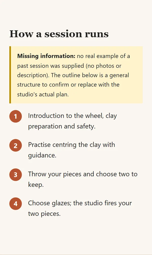
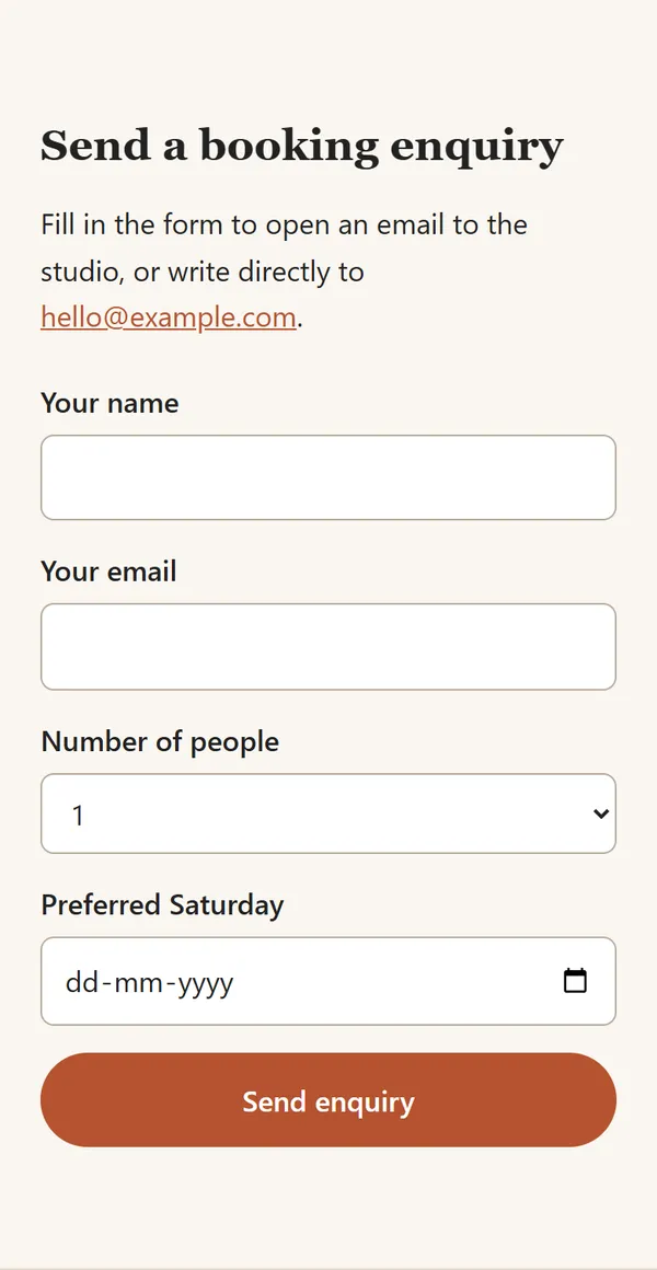
Open version 1 (HTML) · Checklist returned with it
What the review found
- Lighthouse accessibility and best-practice audits scored 100, and nothing overflowed sideways at 390 px or 1280 px. The automated checks did not catch the problems below.
- The page invented a four-step session outline. It labelled the outline as unconfirmed, but the brief had supplied no schedule.
- The enquiry form posted through a
mailto:link, which does nothing for visitors without a configured email app, and its date field accepted any day, not only Saturdays. - Two inline email links measured under 24 px tall, small for a fingertip.
- It correctly marked the address, age limit, accessibility and cancellation policy as missing instead of inventing them.
Revision prompt
Revise the page you built. Keep everything that is not mentioned here.
1. Replace the enquiry form with one "Email the studio" button. Its mailto link should pre-fill the subject "Beginner wheel session enquiry" and a short body asking for name, number of people and preferred Saturday. A mailto form does nothing for visitors without an email app, and the date field accepted any day of the week.
2. Remove the invented "How a session runs" steps. Use only this supplied schedule: 10:00 to 13:00; wheel practice first, then choosing glazes for your two pieces. Keep the studio address marked as missing.
3. Make the inline email links comfortable tap targets, at least 24 px tall.
4. Return the changed sections and an updated checklist.
Revised output
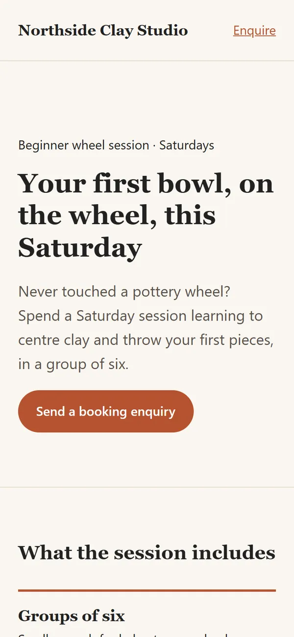
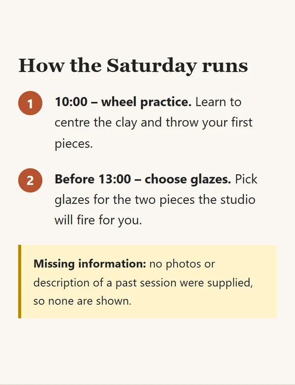
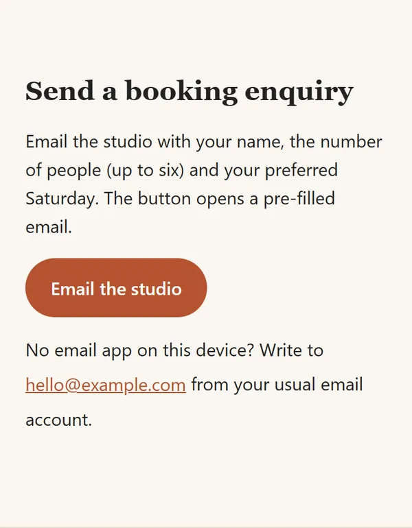
Open version 2 (HTML) · Updated checklist
Version 2 kept both 100 scores, removed the invented steps, replaced the form with one pre-filled email button and passed the 24 px tap-target check.
Limitations of this example
- One run with one tool. Another tool, model or run will produce a different page from the same brief.
- Northside Clay Studio is fictional and hello@example.com is a placeholder; the demo pages are not indexed.
- An automated accessibility score is not a full accessibility review. No screen reader or real-device test was done.
- A mailto button still depends on the visitor having an email app. A real studio would need a form or booking service.
What should you decide before prompting?
Write down one visitor and one job. A portfolio visitor needs to judge your work and contact you; a product visitor needs to understand an offer and decide whether it fits. Choose the action before deciding on effects. Gather approved copy, prices, image permissions and contact details so the tool has facts to work with.
Describe references as decisions: generous spacing, a clear type hierarchy, restrained motion or a prominent example. Supply your own content and ask for an original implementation. A screenshot can communicate a direction, but it does not provide permission to reproduce someone else's design or assets.
How do you turn the template into a working page?
- Replace every bracketed field with your actual project information.
- Ask the tool to list missing inputs before it starts building.
- Build the first screen and primary action, then inspect them in a browser.
- Add the remaining sections once the offer and navigation are clear.
- Request one bounded revision at a time, such as improving mobile spacing or fixing form labels.
For a fictional pottery workshop, the visitor might be a first-time learner and the action might be a booking enquiry. Give the page the actual schedule and contact route before publishing it. This example is an exercise, not a claim that a booking system is included.
What should you check before publishing?
- Read the headline without scrolling: does it explain who the page serves?
- Test every link and form destination. A drawn button is not a functioning enquiry flow.
- Use a narrow screen and keyboard navigation. Check labels, focus, overflow and text size.
- Check page title, description, canonical URL and meaningful image descriptions.
- Confirm that animations respect reduced-motion preferences and do not hide the offer.
AI-generated code still needs review. Ask the tool to explain any backend or account requirements for a form, login or payment step before connecting it to a live service.
Why can the same prompt produce different websites?
Tools, models, supplied content and revision history influence the result. Keep a copy of the brief and compare the generated page with your acceptance checks. If the result is vague, add concrete content and layout constraints rather than repeating adjectives such as premium or modern.
Sources and review
This original exercise is written by PromptPack. It is not a customer case study or a promise of a particular result. For related review guidance, see W3C accessibility checks.
What should you do next?
Try the free exercise in your own tools first. For the complete guide, editable files, actual examples, price and requirements, look inside the related website prompt pack. Tool accounts and credits are separate.
Written by the seller of that kit. You can use this public template without purchasing.